Website Wireframe Guide: A Guide for Freelancers, Agencies, and Businesses
In today’s digital world, having a well-designed website is crucial for any business. Following the KISS (Keep It Simple, Stupid) framework ensures that your website is not only visually appealing but also user-friendly and effective in driving conversions. Here’s a website wireframe guide using EverGreen Landscaping Services, a fictitious home services company, as an example to illustrate how you can create wireframes and a winning website.
Homepage: Making a Strong First Impression
The homepage is the first point of contact between your business and potential customers, making it a critical element of your website. A well-designed homepage sets the tone for your brand, engages visitors, and guides them seamlessly through your offerings. By keeping it simple and focused, you can ensure that your homepage makes a strong and lasting first impression. Here’s how to structure an effective homepage using key elements within the design process to captivate and convert your audience.
Logo Placement
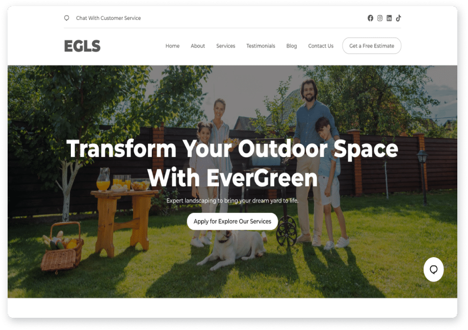
Your logo is the cornerstone of your brand identity, and as one of the key visual elements, it should be displayed prominently for maximum recognition. Aim for a size that is clearly visible without overshadowing other crucial elements. The goal is to ensure your logo stands out but doesn’t dominate the page. Remember, a great logo speaks for itself and doesn’t need to be oversized to make an impact.

Navigation Bar
A clear and concise navigation bar is essential for a seamless user interface and user experience. Include key links such as About Us, Services, Testimonials, Blog, and Contact Us. It’s often unnecessary to include “Home” in the navigation menu, as users typically know to click the logo to return to the homepage. Simplified menus are best; overloading the navigation bar can confuse visitors and detract from the overall aesthetics of your site.
Call-to-Action (CTA) Button
A strategically placed "Get a Free Estimate" CTA button can significantly enhance user engagement. This button should catch the eye and encourage visitors to take immediate action. Depending on your business, this might be a request a quote button, a get in touch button, or another primary action you want users to take. The key is to make it clear, compelling, and aligned with your business goals.
Chat Support Icon
Enhance user experience and satisfaction by positioning a chat support icon in the bottom right corner of your homepage. This feature offers instant customer assistance, showing visitors that you’re there to support their immediate needs. Additionally, most chat integrations can gather customer contact information for follow-up, making it a valuable tool for maintaining ongoing communication and building relationships with potential clients.
By integrating these elements thoughtfully, your website header will not only look professional but also function effectively, guiding visitors smoothly through your site and encouraging them to engage with your business.
By integrating these elements thoughtfully, your website header will not only look professional but also function effectively, guiding visitors smoothly through your site and encouraging them to engage with your business.
Social Media Icons
If your business is active on social media, make sure to include icons linking to your profiles on platforms like Facebook, Instagram, Twitter, TikTok, and LinkedIn. Easy access to these links allows visitors to connect with your brand on multiple channels, fostering deeper engagement and building a community around your business.
Hero Section: Captivate and Convert
Background Image, Headline, and Subheadline
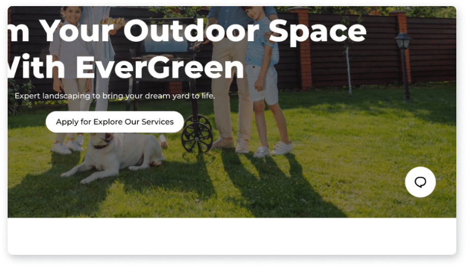
The hero section of your website is a critical part of the user flow and your first chance to make a lasting impression. Use a visually stunning background image that evokes positivity and aligns with your brand’s message. For EverGreen Landscapes, imagine a serene scene of a happy family enjoying a sunny day in a beautifully landscaped garden, complete with a newly built gazebo. This image instantly communicates warmth, happiness, and the high-quality results your company delivers.
Image
Select an image that not only highlights your landscaping work but also evokes a sense of joy and satisfaction. An image featuring a happy family enjoying their outdoor space can resonate deeply with potential customers, creating an emotional connection right from the start.
Headline
Craft a clear and compelling headline that calls visitors to action. A headline like “Transform Your Outdoor Space with EverGreen” is both inspirational and direct, immediately informing visitors of the benefit they will receive by choosing your services.
Subheadline
Complement your headline with a subheadline that reinforces your value proposition. “Expert landscaping to bring your dream yard to life” provides additional context and appeals to the desire for professional, high-quality service.
Primary CTA Button
Your primary call-to-action (CTA) button should be prominently displayed to drive immediate engagement. "Get a Free Estimate" is a powerful CTA that invites visitors to take the first step toward transforming their outdoor space. Ensure this button stands out with a contrasting color and strategic placement within the hero section.
Optional Secondary CTA Button
While a primary CTA button is essential, offering a secondary option can cater to different user preferences. Encourage visitors to explore your services with a secondary CTA button like "Explore Our Services." This button allows users who prefer to browse and learn more before committing to do so with ease.
Alternative CTAs: Consider additional CTAs for a more dynamic user experience. For example, a link to a video showcasing your company can provide an engaging way for visitors to learn more about your services and see them in action. This caters to those who prefer visual content and can help build trust and credibility.
By integrating these elements thoughtfully, your hero section will not only capture the attention of your visitors but also compel them to engage with your business. A visually appealing image, persuasive headline and subheadline, and strategic CTAs work together to create a powerful first impression that can convert visitors into customers.
Promotions Section: Driving Conversions with Special Offers
In today’s competitive market, showcasing special promotions through a well-crafted wireframe mockup is an effective way to capture the attention of potential customers and drive conversions. By highlighting enticing offers and pairing them with clear calls to action (CTAs), you can motivate visitors to take immediate advantage of your services.
Special Offer and CTA
Promotions not only draw attention but also create a sense of urgency, encouraging customers to act quickly. Present your special offers in a compelling way to maximize their impact.
Headline the Promotion:
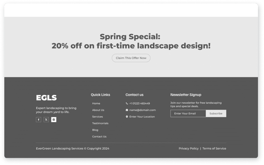
Make sure your promotion is prominently displayed and easy to understand. For instance, "Spring Special: 20% off on first-time landscape design" immediately informs visitors of the value they will receive.
Detailed Description:
Provide a brief explanation of the promotion to add context. For example, "Celebrate the arrival of spring with a fresh new look for your yard. Our expert team is offering a 20% discount on all first-time landscape design projects. Transform your outdoor space at a fraction of the cost!"
Enticing CTA:
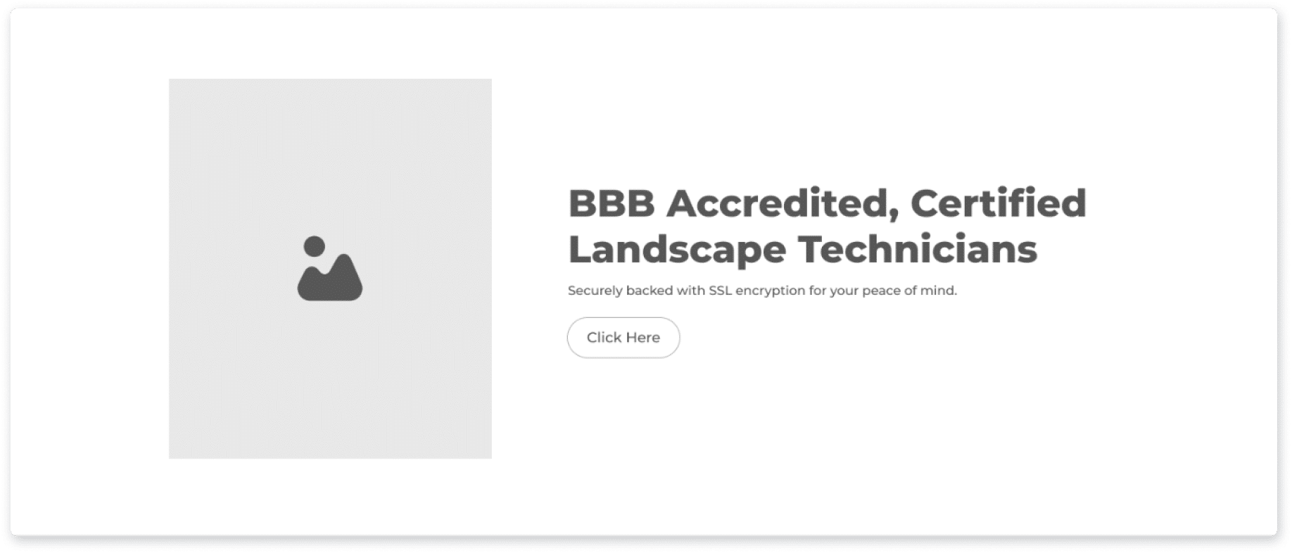
Pair your promotion with a strong call to action that prompts visitors to take the next step. A CTA like "Claim This Offer Now" creates a sense of urgency and encourages immediate engagement. Make sure the CTA button is prominently displayed and visually appealing to draw the eye.
Special Offer and CTA
To make your promotions section even more persuasive, focus on the benefits and value your offer provides to potential customers.
Create Urgency:
Use language that conveys scarcity or a limited-time offer to motivate quick action. "Hurry! This exclusive offer is available for a limited time only. Don't miss your chance to save 20% on your dream landscape design."
Highlight the Value:
Emphasize the benefits and savings the customer will enjoy. "By taking advantage of our spring special, you’re not just saving money—you’re investing in a beautiful, professionally designed outdoor space that will enhance your home’s appeal and value."
Showcase Your Expertise:
Reinforce your credibility and expertise to build trust. "With years of experience and a passion for creating stunning outdoor spaces, our team is dedicated to bringing your vision to life. Let us help you create the perfect retreat right in your backyard."
By strategically highlighting your promotions and pairing them with compelling CTAs, you can effectively capture the interest of your website visitors and convert them into satisfied customers. Showcasing special offers in this way not only boosts conversions but also demonstrates the value and quality of your services, making it clear why potential clients should choose you over the competition.
Footer: Enhancing Engagement and Ensuring Compliance
The footer of your website is more than just the bottom of the page; it’s a crucial area for reinforcing your brand, encouraging user interaction, and ensuring compliance. A well-designed footer can enhance user experience, boost SEO, and foster ongoing engagement with your audience. Here's how to make your footer persuasive and enticing.
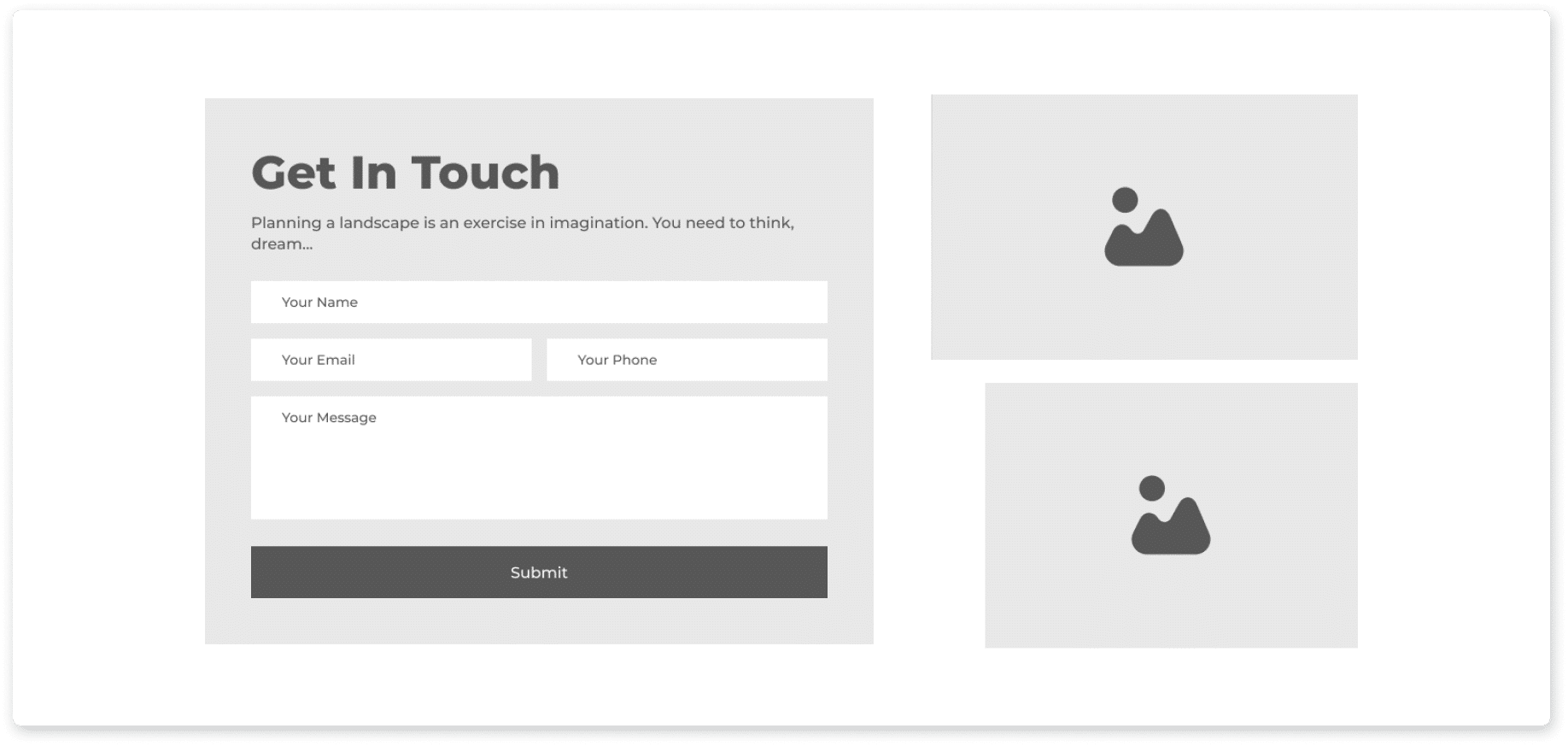
Specials, CTAs, and Newsletter Signup
The footer is an excellent place to repeat key navigation links, highlight special offers, and encourage visitors to stay connected through your newsletter. Utilizing wireframing tools like Figma can help design teams effectively plan and enhance these elements, ensuring a cohesive and user-friendly layout.
Special Offers:
Reinforce your current promotions with a small banner or text reminding visitors of special deals, such as “Spring Special: 20% off on first-time landscape design.”
CTA Buttons:
Include a strong call to action like “Contact Us Today!” to invite further interaction. This final CTA should be prominent and enticing, encouraging users to reach out for more information or to take the next step.
Newsletter Signup:
Encourage ongoing engagement by offering a newsletter signup form. “Join our newsletter for free landscaping tips, special deals, and updates on our latest projects.” This not only keeps your audience informed but also builds a loyal community around your brand.
Navigation Links
Repeating navigation links in the footer improves user experience and supports SEO by preventing orphan pages.
User Experience:
Easy access to important pages from anywhere on your site ensures a smooth and intuitive browsing experience. Include links to Home, About Us, Services, Testimonials, Blog, and Contact Us.
SEO Benefits:
By providing internal links, you help search engines understand the structure of your site and ensure all important pages are indexed. This is particularly useful for preventing orphan pages and boosting your site’s SEO performance.
Legal Links
Ensuring compliance and transparency is essential for building trust and protecting your business.
Privacy Policy and Terms of Service:
Clearly display links to your Privacy Policy and Terms of Service. These documents are crucial for compliance with legal requirements and for setting clear expectations with your users.
Industry-Specific Disclaimers:
Depending on your industry, include any additional disclaimers that may be necessary. For example, if you’re in landscaping, you might need to add disclaimers about the use of certain chemicals or the limits of your service warranties.
Persuasive and Enticing Content
To make your promotions section even more persuasive, focus on the benefits and value your offer provides to potential customers.
Promotions Reminder:
Don't miss our Spring Special! Save 20% on first-time landscape design services. Contact us today to learn more.
Strong CTAs:
Ready to transform your outdoor space? Contact Us Today!" This reinforces your value proposition and invites users to take action.
Engagement Invitation:
Stay connected! Join our newsletter for exclusive tips and special offers.
By thoughtfully designing your footer with these elements, you create a valuable space for user engagement, enhance the overall user experience, and ensure your website is compliant with legal standards. This strategic approach not only supports your SEO efforts but also fosters trust and ongoing interaction with your audience.
About Us Page: Building a Connection
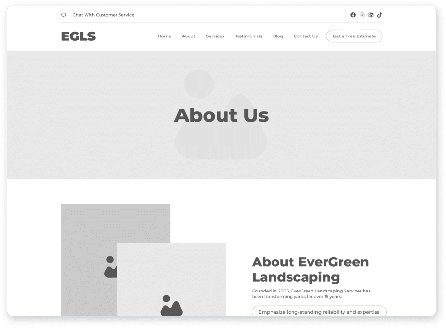
Your About Us page is a pivotal part of your website, providing a unique opportunity to build a personal connection with your visitors. By sharing your company’s story, mission, and team, you can establish trust and differentiate yourself from competitors. Here's how to create a compelling and engaging About Us page.
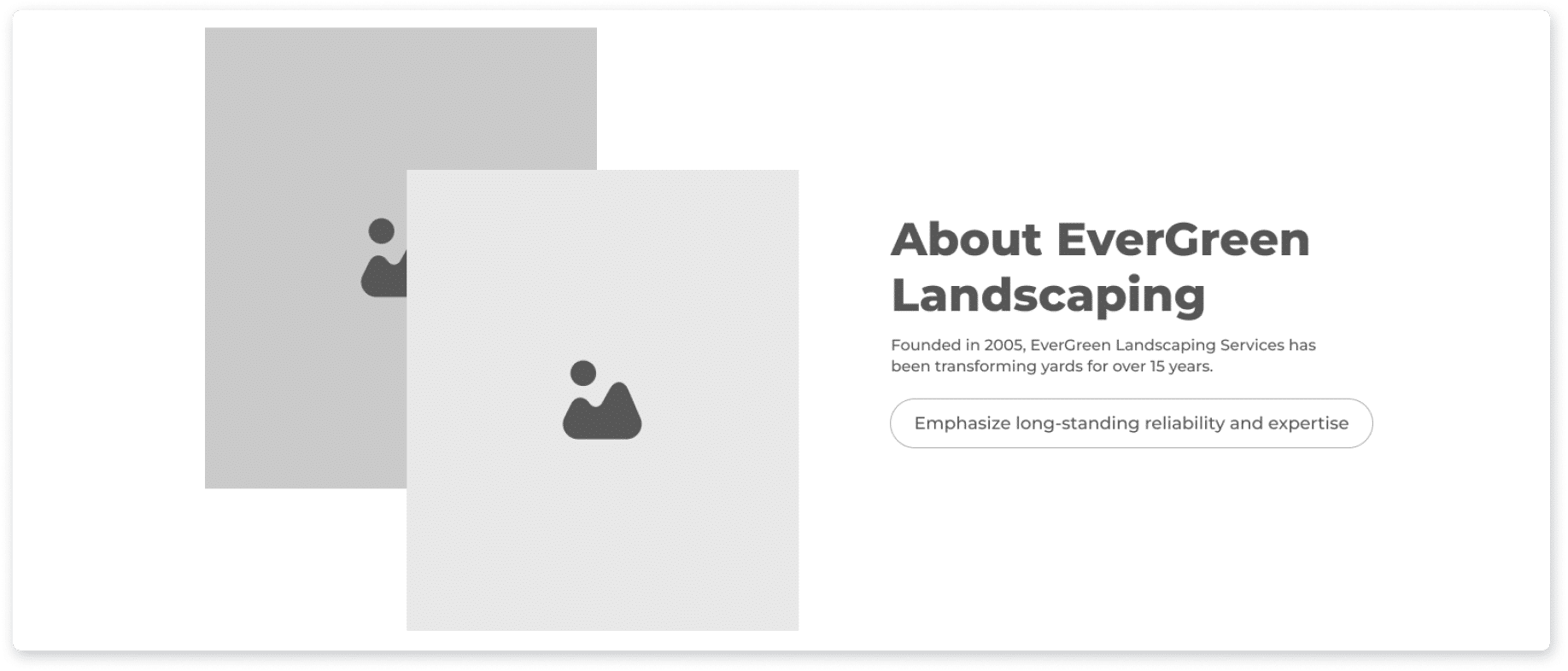
Company Background: Founding and Experience
Your company's history and experience are foundational to building credibility and trust. Share your journey and highlight the milestones that have shaped your business.
Founding and Experience:
Founded in 2005, EverGreen Landscaping Services has been transforming yards for over 15 years. Our journey began with a simple mission: to bring beauty and functionality to outdoor spaces through expert landscaping.
Mission and Vision:
Our mission is to create outdoor spaces that enhance the lives of our clients, providing them with serene and beautiful environments to enjoy with family and friends. We envision a community where every home is graced with stunning landscapes that reflect the unique tastes and lifestyles of their owners.
Unique Differentiators:
What sets us apart from our competitors is our unwavering commitment to quality, creativity, and customer satisfaction. Unlike many in our field, we blend innovative design with sustainable practices, ensuring that our projects are not only beautiful but also environmentally responsible."
Every founder has a unique and interesting story. Share yours to create a deeper connection with your audience. "Our founder, John Doe, started EverGreen Landscaping with a passion for nature and design. With a background in horticulture and years of hands-on experience, John has built a team that shares his dedication to transforming outdoor spaces."
Meet the Team: Photos, Bios, and Team Quotes
Humanize your brand by introducing the people behind your company. Highlighting your team members with photos and personal bios can make your business more relatable and trustworthy.
Photos and Bios:
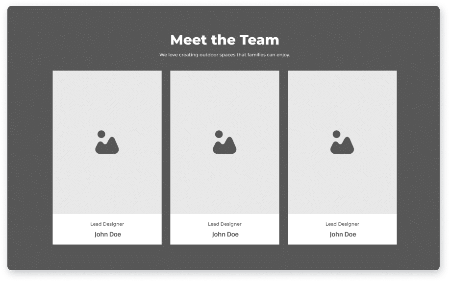
Include high-quality photos and engaging bios of key team members. "Meet Jane Smith, our Lead Designer, whose innovative designs have transformed countless backyards into breathtaking retreats. With over a decade of experience, Jane brings a unique blend of artistry and practicality to every project."
Team Quotes:
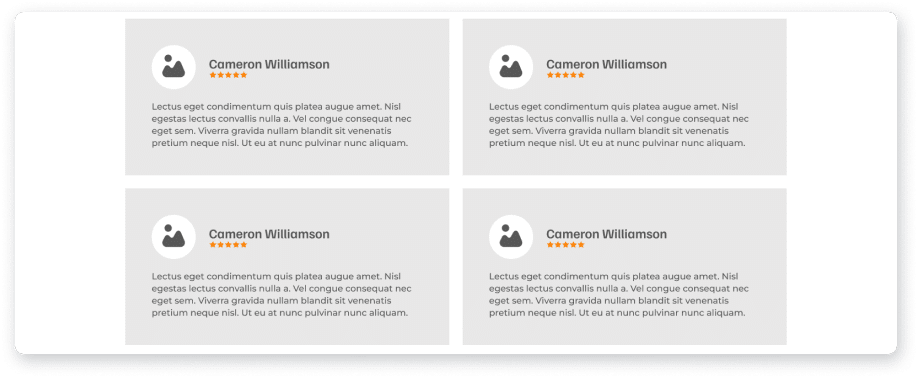
Add personality to your page with quotes from your team members that reflect their passion and commitment. "We love creating outdoor spaces that families can enjoy. There’s nothing more rewarding than seeing our clients’ faces light up when they see their new yard for the first time." – Jane Smith
Persuasive and Enticing Content
Infuse your About Us page with the personality that fits your brand. Whether it's through the language you use, the stories you tell, or the design elements you incorporate, make sure it reflects who you are as a company.
Engaging Storytelling:
Share anecdotes and stories that illustrate your company’s journey and values. "When we first started, we had just a handful of clients and a big dream. Today, we’ve grown into a trusted name in landscaping, thanks to our relentless focus on quality and customer satisfaction."
Visual Appeal:
Use a clean, visually appealing layout that complements your brand’s aesthetic. Include images of your team in action, working on projects, and engaging with clients to provide a glimpse into your company’s culture.
By crafting a persuasive and enticing About Us page, you can build a strong connection with your visitors, earning their trust and encouraging them to choose your services over the competition. This approach not only highlights your expertise and reliability but also showcases the human side of your business, making it easier for potential clients to relate to and engage with you.
By crafting a persuasive and enticing About Us page, you can build a strong connection with your visitors, earning their trust and encouraging them to choose your services over the competition. This approach not only highlights your expertise and reliability but also showcases the human side of your business, making it easier for potential clients to relate to and engage with you.
Services Page: Showcasing Expertise
Your Services page is a crucial part of your website, where you demonstrate your expertise and persuade potential clients to choose your business over competitors. Clear, detailed descriptions and compelling calls to action (CTAs) are key to converting interest into action. Here’s how to make your Services page persuasive and enticing.
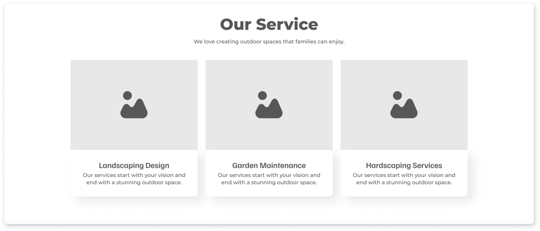
Detailed Service Descriptions
Providing clear and detailed descriptions of each service helps potential clients understand what you offer and why they should choose you. Use reassuring language to convey the quality and reliability of your services.
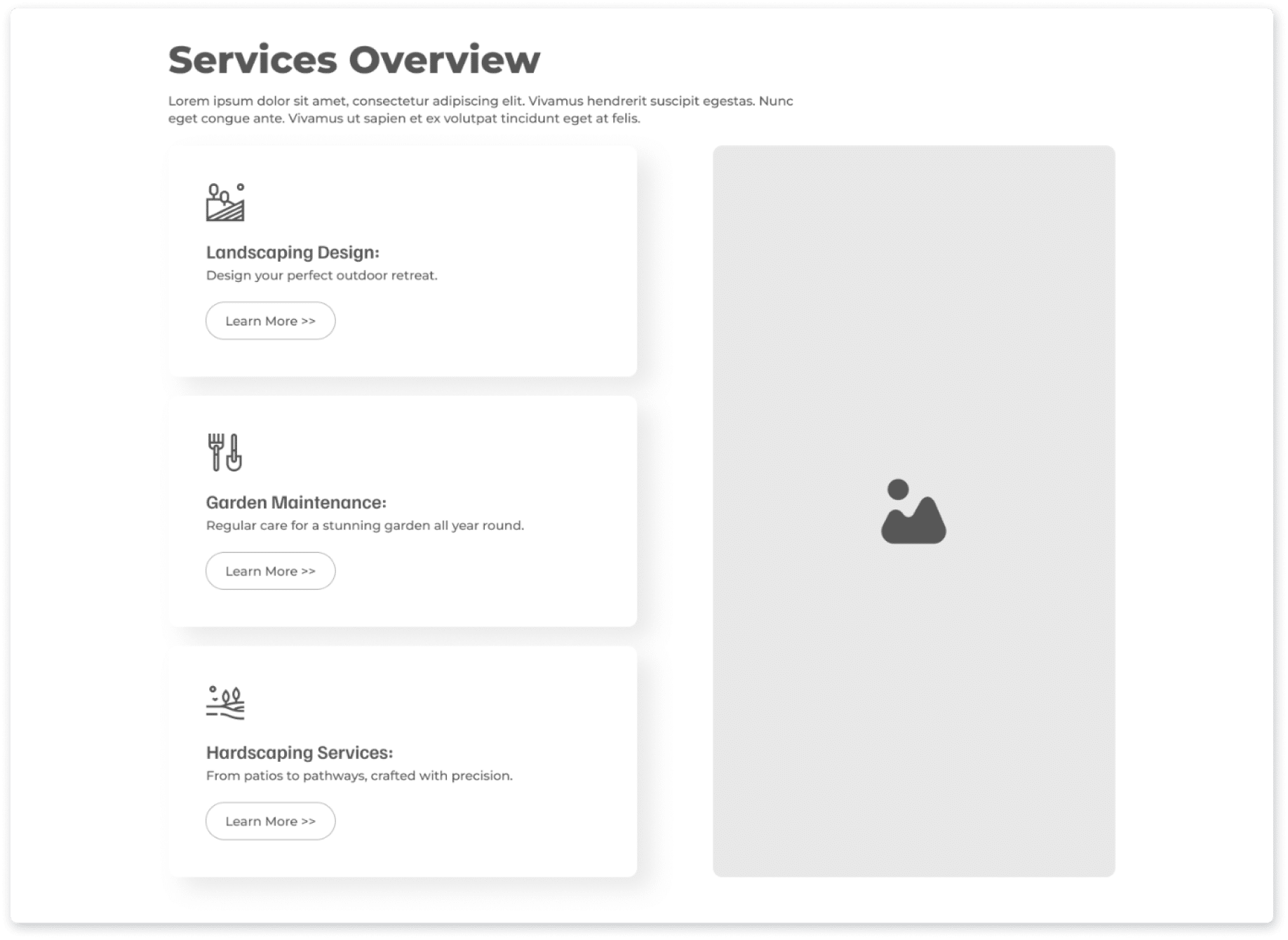
Landscaping Design:
Our landscaping design services start with your vision and end with a stunning outdoor space. We work closely with you to create a design that reflects your style and meets your needs. From concept to completion, we ensure every detail is perfect, transforming your yard into a beautiful retreat.
Garden Maintenance:
Keep your garden looking its best all year round with our comprehensive garden maintenance services. Our team handles everything from mowing and pruning to pest control and fertilization, ensuring your garden remains vibrant and healthy.
Hardscaping Services:
Transform your outdoor space with our expertly crafted hardscaping solutions. Whether it’s a new patio, a winding pathway, or a retaining wall, our skilled team uses the highest quality materials and techniques to create durable and beautiful structures.
Web Design:
Our web design services begin with creating digital wireframes to gather client feedback and refine the website layout. This crucial step ensures that the structure and content are perfect before advancing to the visual design stage. We focus on creating low-fidelity wireframes that emphasize functionality and user experience, ensuring clients understand these are not final design mockups.
Meet the Team: Photos, Bios, and Team Quotes
Humanize your brand by introducing the people behind your company. Highlighting your team members with photos and personal bios can make your business more relatable and trustworthy.
Photos and Bios:
Include high-quality photos and engaging bios of key team members. "Meet Jane Smith, our Lead Designer, whose innovative designs have transformed countless backyards into breathtaking retreats. With over a decade of experience, Jane brings a unique blend of artistry and practicality to every project."
Team Quotes:
Add personality to your page with quotes from your team members that reflect their passion and commitment. "We love creating outdoor spaces that families can enjoy. There’s nothing more rewarding than seeing our clients’ faces light up when they see their new yard for the first time." – Jane Smith
Service-specific CTA
Encourage potential clients to take the next step with clear and compelling calls to action. Each service description should be paired with a specific CTA to guide visitors towards scheduling or contacting you.
- Landscaping Design CTA: “Schedule Your Design Consultation Today!”
- Garden Maintenance CTA: “Get a Free Maintenance Quote!”
- Hardscaping Services CTA: “Book Your Hardscaping Project Now!”
For local pages, ensure you mention your service area to optimize for SEO purposes and make it clear where you operate.
Service Area Mention:
Proudly serving the [Your City/Region] area, we bring local expertise and a commitment to community to every project."
Unique Selling Points
Highlight what sets you apart from competitors to make a compelling case for why potential clients should choose your services.
Creativity and Sustainability:
Choose EverGreen for unmatched creativity and dedication to sustainability. Our innovative designs and eco-friendly practices ensure that your outdoor space is not only beautiful but also kind to the environment."
Creativity and Sustainability:
Choose EverGreen for unmatched creativity and dedication to sustainability. Our innovative designs and eco-friendly practices ensure that your outdoor space is not only beautiful but also kind to the environment."
Customer Satisfaction:
At EverGreen, customer satisfaction is our top priority. We work closely with you throughout the entire process to ensure your vision is realized and you are thrilled with the results.
Persuasive and Enticing Content
To make your Services page even more persuasive, use engaging and benefit-focused language. Emphasize the positive outcomes and advantages of choosing your services.
Landscaping Design:
Imagine a garden that feels like a personal paradise, perfectly tailored to your taste. With our landscaping design services, this dream becomes a reality. Let us create an outdoor space that you'll love coming home to every day.
Garden Maintenance:
A well-maintained garden not only looks beautiful but also enhances your home's value and appeal. Our garden maintenance services ensure that your outdoor space remains lush and inviting, without you having to lift a finger.
Hardscaping Services
From elegant patios to durable retaining walls, our hardscaping services add both functionality and aesthetic appeal to your yard. Trust us to build structures that are as stunning as they are sturdy.
By integrating these elements into your Services page, you effectively showcase your expertise, differentiate your offerings, and guide potential clients toward taking action. This strategic approach not only highlights your capabilities but also makes it easy for visitors to understand the value you provide and how to engage your services.
Additional Pages, Wireframe Design, and Technical SEO Aspects
To ensure your website is not only visually appealing but also functional and optimized for search engines, it's crucial to focus on technical SEO aspects and additional pages that enhance user experience and engagement. Here’s how to effectively implement these aspects:
Mobile Optimization and ADA Compliance
In today’s mobile-first world, it’s essential that your website is fully optimized for mobile devices. This means ensuring that all content is accessible, easy to navigate, and visually appealing on smartphones and tablets.
Responsive Design:
Use responsive design techniques to ensure your website adjusts seamlessly to different screen sizes and devices.
Fast Loading Times:
Optimize images, scripts, and other elements to ensure quick loading times on mobile devices, enhancing user experience.
ADA Compliance:
Make your website accessible to all users by complying with the Americans with Disabilities Act (ADA) standards. This includes providing text alternatives for images, ensuring easy navigation, and using accessible forms and buttons. Interactive wireframes can help simulate real user interactions and gather feedback on usability before development.
Every founder has a unique and interesting story. Share yours to create a deeper connection with your audience. "Our founder, John Doe, started EverGreen Landscaping with a passion for nature and design. With a background in horticulture and years of hands-on experience, John has built a team that shares his dedication to transforming outdoor spaces."
Analytics Integration
Understanding how users interact with your website is key to continuous improvement. Integrate analytics tools to gather detailed insights into user behavior.
Google Analytics:
Implement Google Analytics to track page views, user sessions, bounce rates, and other essential metrics. This data helps you understand what’s working and what needs improvement.
Heatmaps and User Recordings:
Use tools like Hotjar or Crazy Egg to visualize how users interact with your pages. Heatmaps show where users click, scroll, and spend the most time, providing valuable insights for optimizing your layout and content.
Goal Tracking:
Set up goal tracking to measure conversions, such as form submissions, phone calls, and newsletter sign-ups. This helps you assess the effectiveness of your CTAs and other engagement strategies.
Regular Updates
Keeping your website fresh and up-to-date is crucial for maintaining SEO rankings and user engagement.
Content Updates:
Regularly add new blog posts, update existing content, and refresh service descriptions to keep your site relevant and informative. This not only engages users but also signals to search engines that your site is active and valuable.
SEO Maintenance:
Continuously optimize your website for search engines by updating keywords, meta descriptions, and title tags. Regularly check for and fix any broken links or outdated content.
User Feedback:
Use analytics data and user feedback to make informed updates and improvements. This ensures that your website evolves in line with user needs and preferences.
By focusing on these additional pages and technical SEO aspects, you can create a website that is not only user-friendly and engaging but also optimized for search engines and compliant with accessibility standards. This holistic approach ensures a positive experience for all visitors while maintaining and improving your online presence.

Additional Pages, Wireframe Design, and Technical SEO Aspects
By following the KISS (Keep It Simple, Stupid) framework and focusing on essential elements, you can create a simple yet effective website wireframe that provides a seamless and engaging user experience. Prioritizing clean design, intuitive navigation, clear CTAs, and engaging content ensures that your website not only looks great but also functions optimally.
Whether you are a freelancer, agency, or business, these guidelines will help you build a website that drives conversions and achieves your digital marketing goals. Emphasizing the wireframing process, mobile optimization, ADA compliance, regular updates, and detailed analytics integration will further enhance your site’s performance, keeping it relevant and user-friendly. By implementing these best practices, you’ll create a website that stands out in today’s competitive digital landscape, attracting and retaining more visitors effectively.
Whether you are a freelancer, agency, or business, these guidelines will help you build a website that drives conversions and achieves your digital marketing goals. Emphasizing the wireframing process, mobile optimization, ADA compliance, regular updates, and detailed analytics integration will further enhance your site’s performance, keeping it relevant and user-friendly. By implementing these best practices, you’ll create a website that stands out in today’s competitive digital landscape, attracting and retaining more visitors effectively.